Problem:
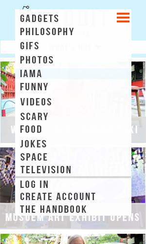
A growing phenomenon in the world is that more people are accessing the web from mobile devices over traditional desktop browsers. This creates a need for more websites to have a responsive design, a layout that is able to adapt to changing screen sizes. Another aspect of design that we explored in this course is web accessibility. Often, sites are designed without basic utility for individuals with disabilities. Impaired users are unable to tab through the site with their keyboards, or sites have elements that are incompatible with screen readers.
Goal:
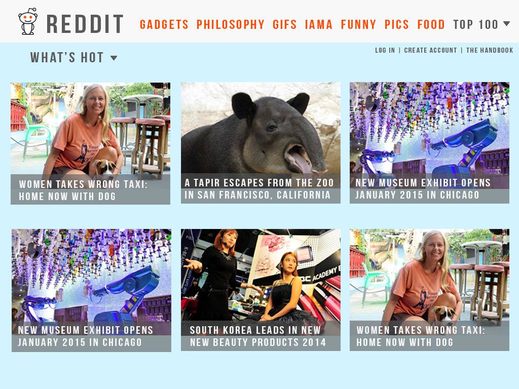
For this project, I decided to tackle a prototype redesign of the popular forums site Reddit. Reddit is a good example of a relatively popular site with poor design. The site is extremely text heavy with little visual hierarchy for guidance. In addition, it is unresponsive when transitioning to a mobile view and each subreddit (sub forums within the site) implements their own varying styles. Finally, the site is inaccessible when navigating with a keyboard and the images on the site don't contain alt text making it impossible for a screen reader to interpret elements on the site.
We aimed to prototype a redesign of the site that would address all of these issues.
PROCESS:
Paper Sketches:
2. Hi-Fidelty Mock-ups
3. Icons
Using icons to represent all of the various sub forums on the site. This creates a more consistent look and conveys a clearer meaning to the user.
RESULT AND TAKEAWAYS:
While it was beyond the scope of this project to replicate all of the functionality of Reddit, we did accomplish the tasks of making the sight look much better, giving a responsive design and making it more accessible through the keyboard. I utilized a Jquery Plugin called Mix It Up to create the sorting animations on the homepage. As more content gets added, Mix It Up's sorting functionality will make it much easier to find content. This was also one of my first exposures to web design and I learned a ton of new technical skills as a result.
Tools used: HTML, CSS, Twitter Bootstrap, Google Fonts, Jquery (Mix it Up), PHP, Adobe Illustrator


